
Mankind has long presented all sorts of data in graphical form. Hardly surprising! According to a study by the Massachusetts Institute of Technology, 90% of the information transmitted to the brain is visual! Surely each of us has seen old maps depicting the image of the earth at that time, or individual cities. Today we are sharing our knowledge about data visualization – how it works, how it is defined and what are its advantages. We will also present some, in our opinion, interesting examples of it, as well as look at the tools for carrying it out. Data visualization is an important field that we will try to introduce you to.

For the convenience of readers, we have divided the article into two parts: a basic one, explaining data visualization, and an advanced one. In the latter, those with at least a basic knowledge of business analytics will be able to read about specific applications of data visualization and the benefits their organizations can derive from it.
We invite you to read more!

A brief definition of data visualization
We encounter data visualization every day – surely everyone has seen examples of a line graph or pivot charts. Just look at the front pages of newspapers. We see visualization of inflation levels, comparison of average temperatures in recent years, or election results. All infographics, point, line, pie, bar or area charts, pivot tables, as well as heatmaps, cartograms or histograms that we see are just visualized data.
Benefits alone
With data visualization, you can track trends and make better decisions by taking full advantage of the information collected in your organization. What’s more, visualization will help you gain a full picture of your company’s business situation, which will enable you to draw valuable conclusions and translate into better forecasting.
As estimated by Statista, the value of the global data visualization market in 2023 will be $7.76 billion, compared to 2017, when the amount was $4.51 billion. The growth in the value of this market is therefore expected to increase by approx. 72%.
Advantages of data visualization
Data visualization provides a quick and easy way to present and enable conclusions to be drawn from vast amounts of data – note how many sides we are inundated with information from on a daily basis. Even the most analytically-minded CEO will not be able to synthesize data effectively on his own. In addition to collecting the data, it will need to be interpreted and analyzed – with a visualization tool, the viewer needs less time, which means decision makers will get tangible value from the data faster. Thus, time-to-value – a trendy English-language term – will be shortened.

In short, data visualization provides:
- Giving structure to the data you have;
- Reducing the time it takes to make the right decisions based on data;
- Minimizing decisions made intuitively;
- The ability to study data from anywhere in the world;
- ease of sharing information inside and outside the organization;
- faster reporting;
- wide accessibility to the data and its better understanding by non-specialists;
- easier optimization of company processes;
- saving time during meetings, which is also not insignificant.
- data storytelling, or “dressing up data in stories” to make it more interesting;
- Saving time and resources – no need to engage developers to create business analytics solutions,
- democratization of data.
Data visualization the best way to communicate information?
It has been known for a long time that it is easier to understand a picture than strings of numbers or excel tables. Regardless of what we want to convey – the statistics of girls’ births in Sosnowiec in 1987-89, the increase in sales in the last quarter, or the progress of the construction of the Sagrada Familia church – in each case it will be better to do it with a picture.
By visualizing data, such as in the form of charts, you increase the chance of achieving the desired result: effectively sharing information with the recipient. Modern tools aggregate huge amounts of data – it would be virtually impossible to understand it if it were not presented in graphical form.

Good data visualization, that is?
Now for some tips. What is worth keeping in mind when preparing a data visualization? It must be understandable to the viewer and must not tire or confuse him. The primary goal is to convey information effectively. Thus, one should:
- know for whom and why we are creating a particular visualization;
- Always check the validity of the data;
- first, it is best to use simple forms of charts like columns, lines and points;
- Several visualizations pertaining to the same area are combined into one panel chart;
- avoid three-dimensional charts;
- label the charts so you can understand them right away – leaving no room for ambiguity;
- use subdued colors, highlighting the most important information with the brighter ones;
- avoid sophisticated fonts.
Finally, the most important thing: you should not misrepresent the visuals! You will learn more about this in the rest of the article.
Most interesting examples of data visualization
This paragraph will begin with interactive visualizations. Number one was probably the most visited site during the “hot phase” of the COVID-19 pandemic. Johns Hopkins University of Medicine created a site where we could follow the spread of the virus in real time.

source: https://coronavirus.jhu.edu/map.html
NASA, on the other hand, makes it possible to track fires that break out around the world. The fires are detected from space by observation satellites orbiting the Earth.

source: https://firms.modaps.eosdis.nasa.gov/map/#m:advanced;d:24hrs;@0.0,0.0,3z
Want to know the locations of mobile network transmitters? Nothing simpler – just check out the map below!
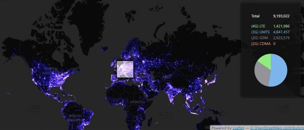
source: https://alpercinar.com/open-cell-id/
Data visualization in the context of Big Data
Big Data is huge amounts of information in many datasets – tera and petabytes – that a human would not be able to comprehend. The information can come from very many sources and be generated by humans or devices, such as vehicles, IoT ecosystems or satellites. Powerful tools and artificial intelligence are needed to gather it quickly (almost in real time), analyze it and draw conclusions.
Big Data is used in many fields, such as:
- Industry: to increase productivity;
- Agriculture: to increase yields, food security, better use of agricultural space;
- public sector: CSO, Social Security or the Ministry of Health and their subordinate institutions – tax fraud detection, road network planning, unemployment prevention, etc.
Big Data also allows marketing departments to learn more about customers: what users click on (CTR), what forms of delivery they prefer, what age groups they represent. Through data processing, city authorities can learn statistics related to traffic, drivers can find the best route with Google Maps, and in turn, banks can learn from customer behavior to prevent theft or extortion.
Embedded Analytics
Unlike traditional business intelligence, which involves the use of external applications, embedded analytics enables analytical tools to be used from within the business application already in use in the organization. Thus, there is no need to switch between applications, resulting in a time savings of 1-2h per week for each user (source: Nucleus Research, report “Augmenting intelligence with embedded analytics”).
Embedded analytics allows you to embed analytical tools in the interface of the business applications you use, integrate data with an external application, and independently build dashboards (dashboards)and customize them according to your needs. Importantly, embedded analytics allows you to create and share reports with people outside your company: customers, partners or suppliers.
Note the skewed visuals!
Over the years, people have become immune to advertising slogans or politicians’ promises. The case is somewhat different if we are presented with data in graphic form, and these are easily manipulated. But why would anyone want to visualize data in such a way as to mislead the viewer? If only to reinforce their narrative, although sometimes this can be a simple mistake. So how can data visualization be manipulated, consciously or not?
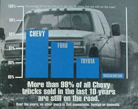
Inadequate scale or change of scale
You should start the Y-axis at “0,” otherwise a difference of a few percent can seem colossal. This is what Chevrolet had in mind in the – misleading – 1992 ad. It’s a classic example of cherry picking, i.e. picking only events that fit the narrative.
source: https://ed.ted.com/lessons/how-to-spot-a-misleading-graph-lea-gaslowitz
The scale on the Y-axis should be proportional to the X-axis, otherwise the graph may not be readable. Moreover, the X-axis should cover a wider time range than, say, a few months. Otherwise, the graph may distort reality. This happens when companies want to boast of month-on-month growth, while on a yearly basis the growth would not be so striking.
Using an inappropriate chart to convey information
A good (bad) example is the pie chart and its use for data that does not add up to 100%. For example, when we study awareness of several brands among a target group, we should use the simplest column chart. In addition, in the case of a pie chart, each section of it should be described, which can make it difficult to read. Below are examples of how to present visit statistics on different social networks – one not the best, the other optimal.
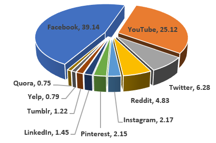
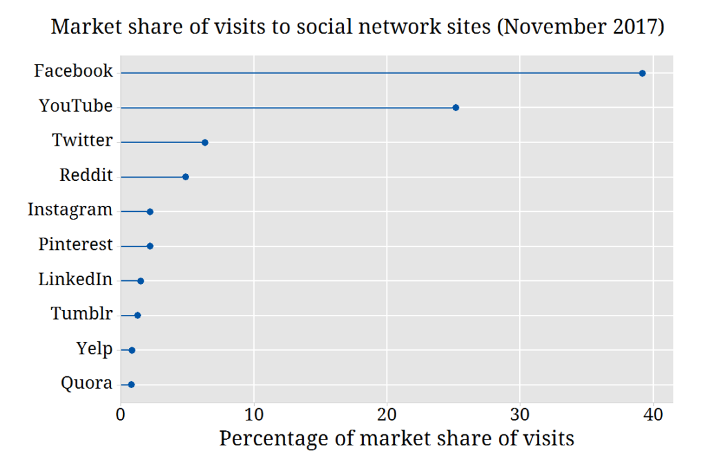
image source: Statistical Consulting Centre
Another example is the use of a graph to present cumulative data. When we present sales of a product over the years the cumulative numbers will show an upward trend, which can be misleading.
Some interesting facts in the context of data visualization
Now here are some interesting business analytics facts. As you read these, you will surely agree that data visualization makes sense and can fundamentally improve your work.
- 2.5 quintillion (10 to the power of 30) bytes are generated daily (source: FinancesOnline)
- Facebook users post 350 million photos a day (4 petabytes, or 10 to the power of 15), and Twitter users post 500 million tweets each day (source: Raconteur);
- British engineer, economist and statistician William Playfair is considered the originator of the bar chart – the first known chart of this type was published in 1786 (source: historyofInformation.com);
- Human brains process visuals 60,000 times faster than text (source: University of Minnesota);
- A Wharton School of Business study found that using data visualization can shorten business meetings by 24%.

Business intelligence tools for data visualization
It is no secret that the choice of tool will depend primarily on the needs of your organization. You will find many tools on the market. Some are uncomplicated like spreadsheets and presentation software. The more complex ones include Google Data Studio, Tableau, Microsoft Power BI and Oracle Analytics.
What should you look for when choosing a business intelligence tool? First of all, your needs, available budget and the size of your Data Analytics team – if you have one in your organization. It’s also important whether it will be used by professional analysts or business users, such as consultants, salespeople or boards of directors, for whom analytics is not a passion, but a stepping stone to a specific business decision.
For us, as a Salesforce partner, the obvious choice is Tableau – a solution integrated into the Salesforce ecosystem in 2019. Our Data Analytics department uses this business intelligence tool on a daily basis, helping customers gain invaluable insights from their business data.
In this category on our blog you will find articles on business analytics.
Here, in turn, you can learn more about Tableau and if you have any questions, consult our specialists who will advise you on the best solution for your organization.

")


